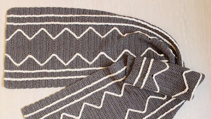
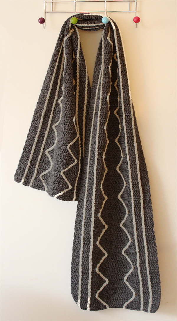
Seeing this scarf as my design may seem odd to you! If you have followed me for a while and especially if you have seen my Instagram account you know that I normally create very colourful designs. But it’s good to do something different for a change too!
Last spring Simply Crochet magazine‘s mood boards for this winter season included many different styles. Most were colourful, and you will see a colourful design by me later this spring. But one mood board was full of geometric designs in black, white and grey. I decided to suggest one design using those.
My way of designing is not to draw anything. I just see the new design in my head and I directly begin to try it out by making small samples. So it takes an effort to design for a magazine because they need to see an image of what the design would look like. I made mine in Photoshop.
I decided to have surface crochet of some sort over a simple background. I tried out a whole lot of different ways of making it. I’m lazy so I didn’t want anything that would be too difficult to explain in the pattern!
Here’s a photo of the sample I sent to the magazine. They asked me to reverse the colours and I agreed. I think it looks better on the dark grey background.
This post contains affiliate links. It means that if you purchase a product I recommend, I may earn a small commission with no added cost to you.
Pattern
The pattern for the scarf is in the Simply Crochet issue 67 that just came out.
I’m happy that the scarf is also featured in the magazine cover. And yes, my name is spelled wrong in connection with the pattern bu it is my design!
In making the final scarf I used Drops wool and a Clover soft grip crochet hook. I crochet so much that the soft grip ones are helping so that my hands don’t hurt!
Pin the scarf


I admire fresh new ideas,congrats
Thank you for your comment 🙂
Hi, Tuula!
Your design has inspired me to ‘jazz’ up items I crochet for charities. For convenience sake I use common stitches and simple patterns for hats, scarves, etc. Adding embellishments like these decorative stitches will make the items more special and attractive. Thanks!
Rosemary K.
Minneapolis, Minnesota USA
PS – we have had a hotter than usual summer, too. Here in the US upper Midwest we need good furnaces and air conditioners!
This comment seems to have appeared on my dashboard now, hmm… Sorry for not answering! Yes, various types of surface crochet can really add to crochet made in basic stitches.
I’m hoping the next summer won’t be as hot!